CLIENT
Extreme Networks
PRODUCT
Enterprise-grade networking solution provider, including high-velocity networking, wireless, security, and cloud support. Historical industry focus of higher education, healthcare, hospitality, and the public sector.
THE PROBLEM / ASK
Extreme Networks wanted to revitalize their global partner program, starting first with their B2B cobranded collateral ahead of their upcoming summit. Design needed to reflect new positioning of agile market thought-leader, be simple, and evoke excitement, vibrance and strength. Together with the client, the sports theme and Ultimate Warrior campaign name was reached to target new stadium market and highlight new IoT offerings.
MY ROLE
I was tasked with ideating and designing a campaign logo, all digital collateral, and a brand guide. I worked independently on all visual design elements.
SUCCESS METRICS
• Global partner growth at 2% month over month
• U.S. partner growth of 25% in year one
ULTIMATE WARRIOR LOGO
In keeping with brand consistency, I designed the above final logo, below is explanation of my process and representation of the options presented.
LOGO CONCEPTS
Inspiration was immediately found in the Extreme Network logo. I saw that simply turning the logo on it's side would create a W for warrior and a U for ultimate. Needing more than one concept, I turned to find some search result inspiration online. Using search topics such as "warrior", "sports team warrior" and "warrior mask" to give me the leg up and form more ideas.
Part of my ideation process is collecting inspiration. Google searches, stock sites and competitor sites searching for information to make a concept come together. I collect any content that speaks to a concept, direction or idea, then sort the content into concepts. If I don't know what direction to go in, within a few broad search queries, usually concepts start to fall forward and are formed. I find that starting high level with a broad topic such as "warrior" then while searching, other refined topics bubble to the top such as in this case "warrior mask".
BRAND USAGE GUIDE
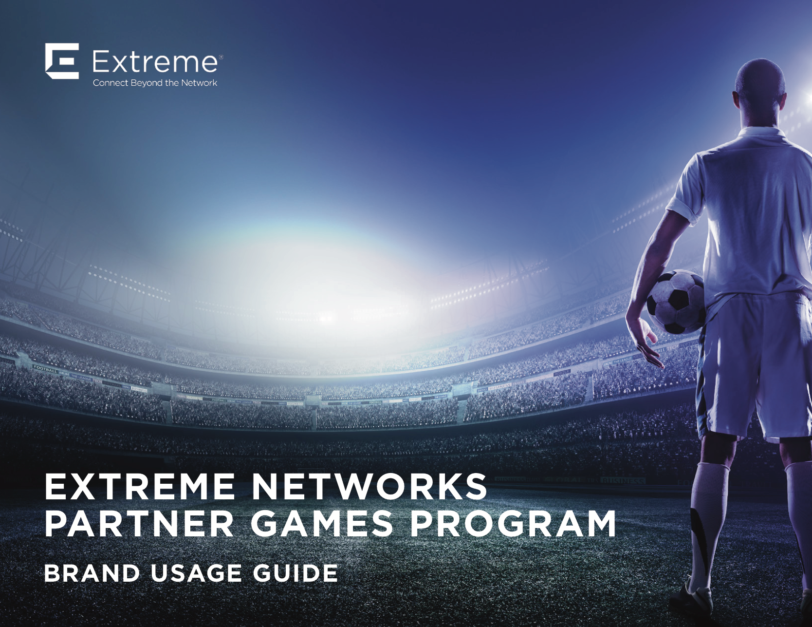
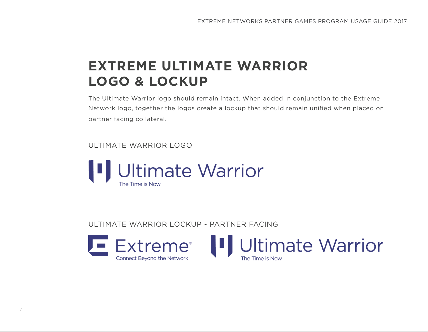
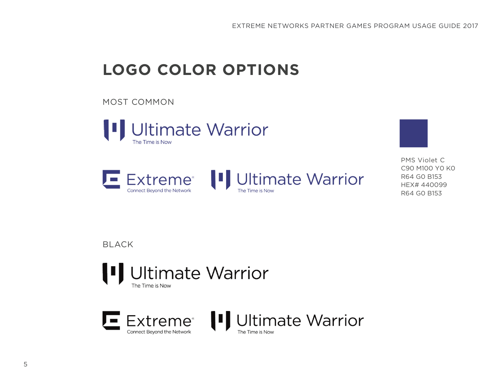
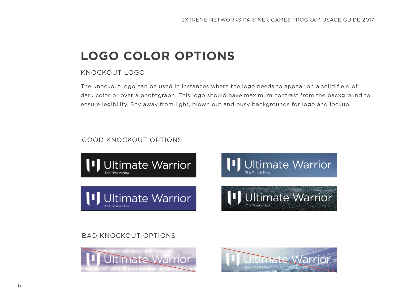
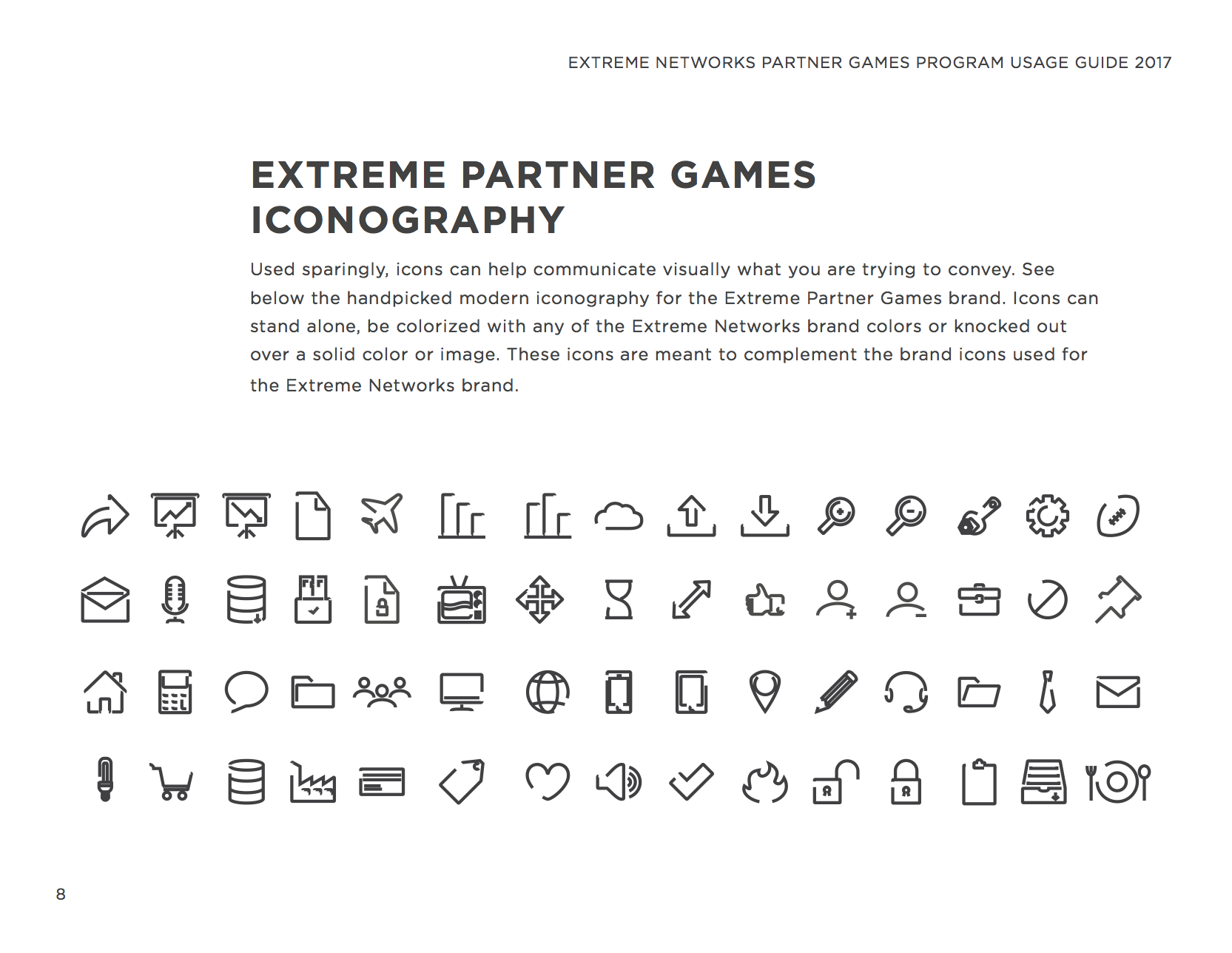
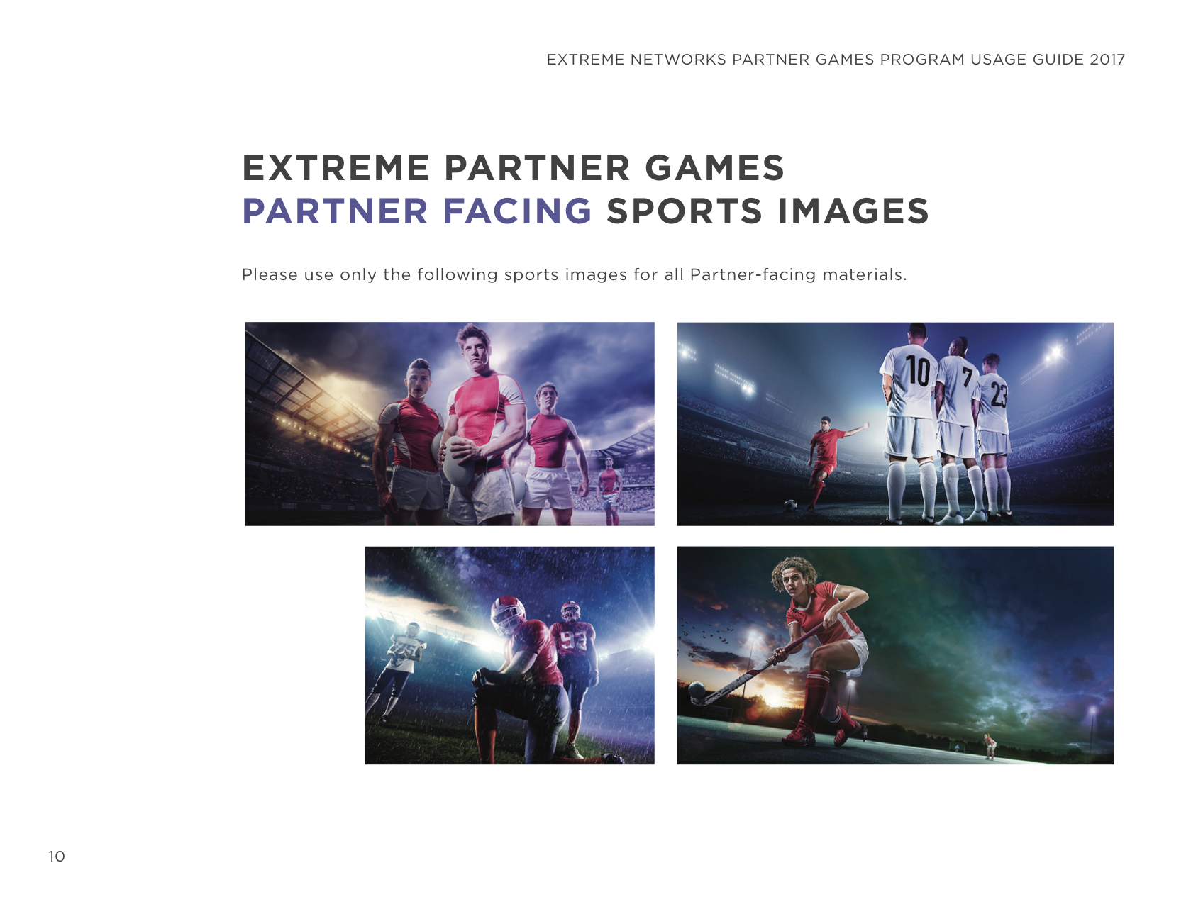
To be able to determine how to use all the above collateral, the brand usage guide was constructed, complete with iconography and examples of partner logo placement.
EMAIL
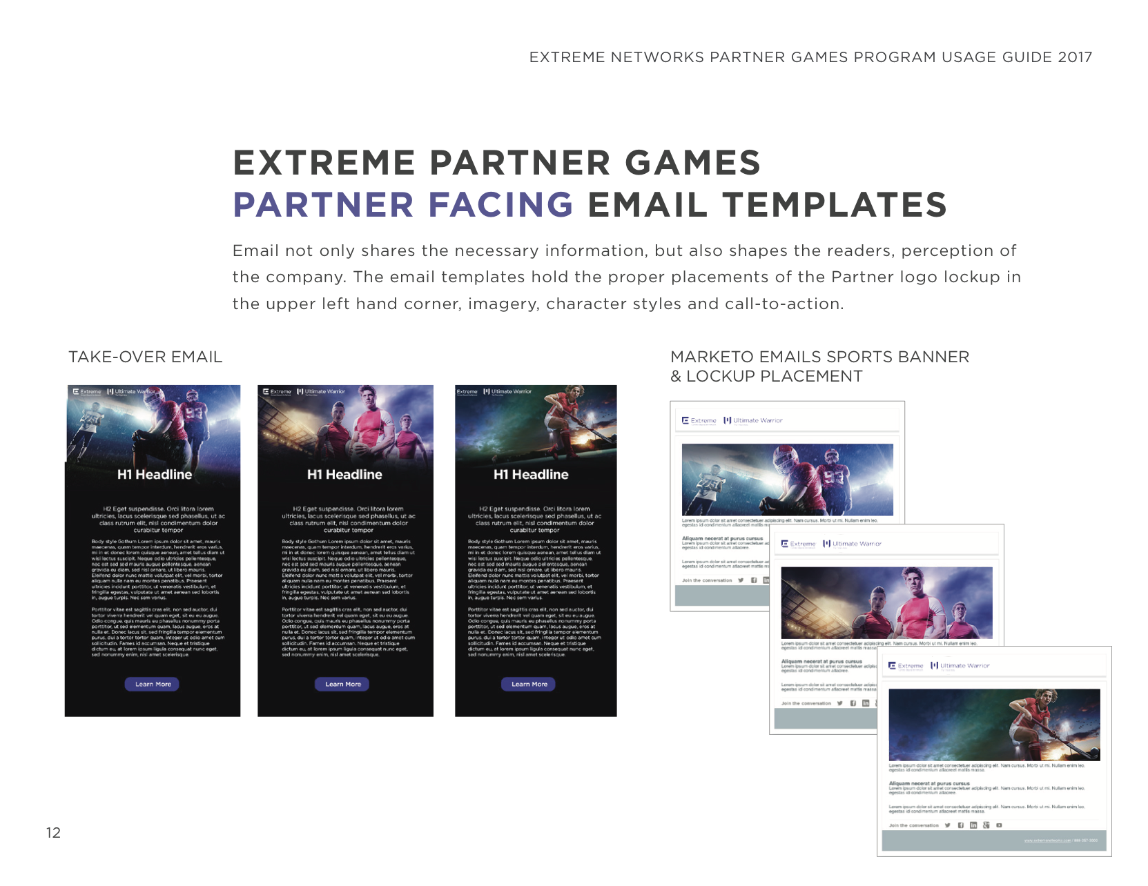
Striking single call-to-action email options were a favorite with the client. Separate banners were also created for easy drop into their pre-templated Marketo emails.
PRESENTATIONS
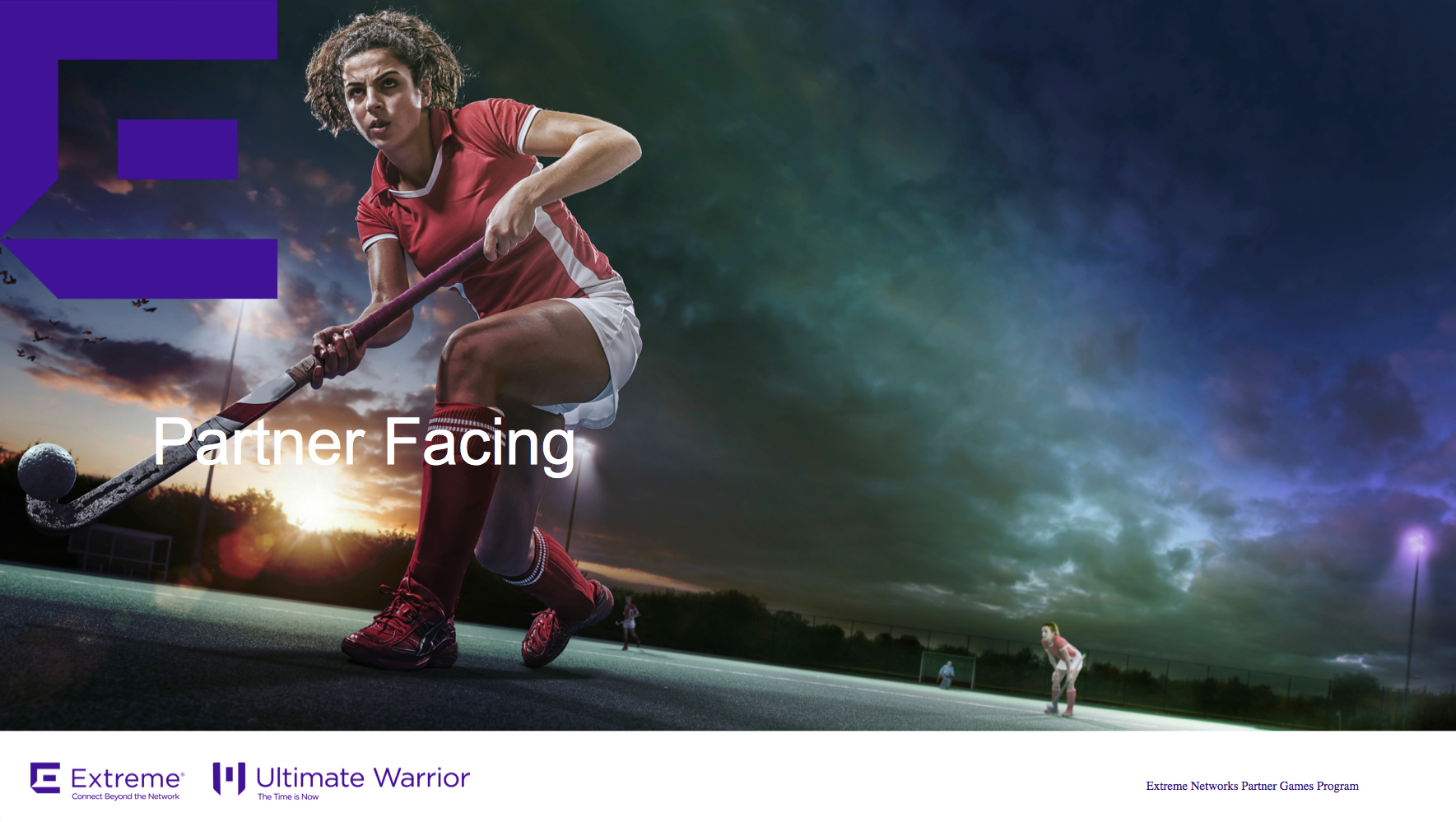
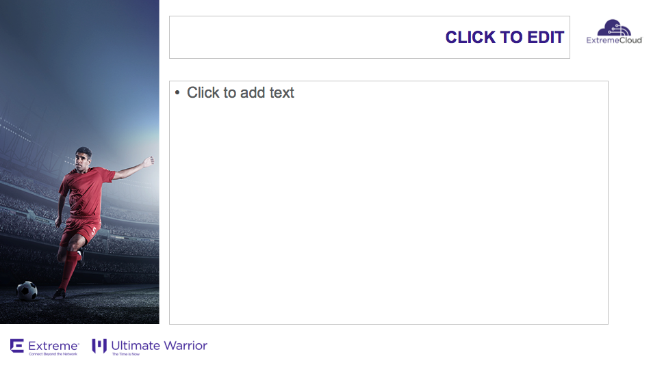
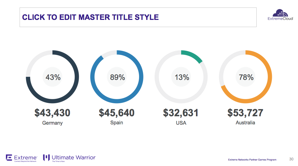
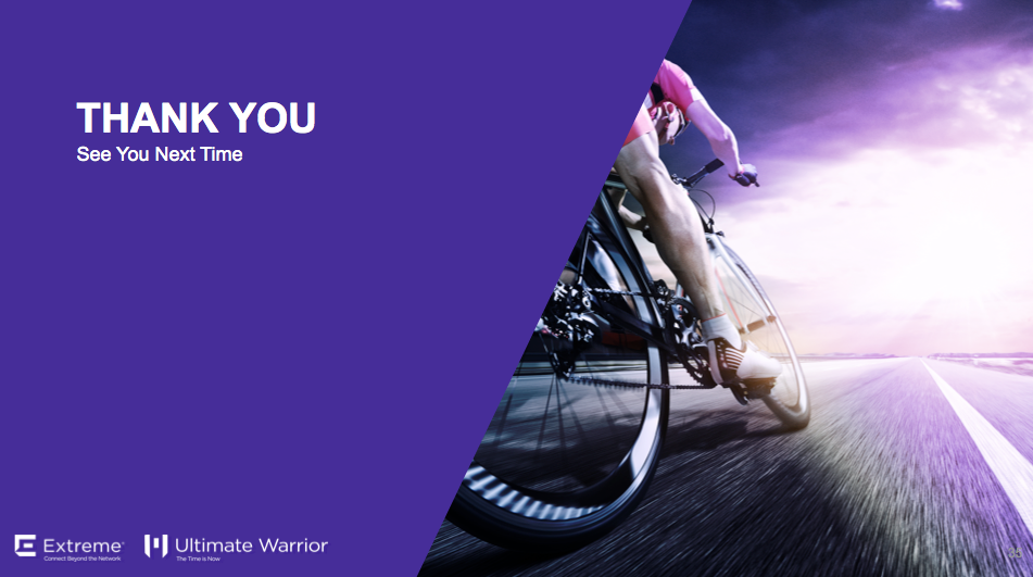
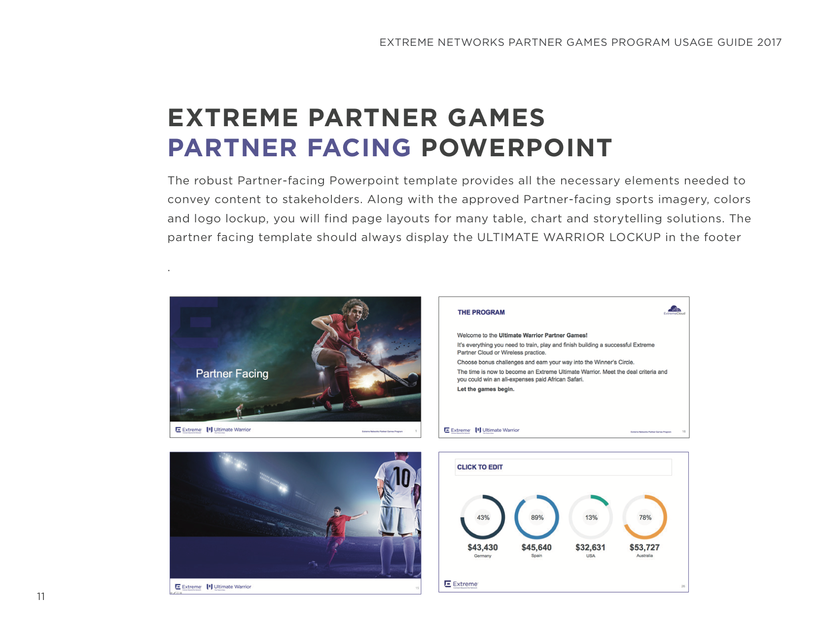
Two 35-page presentation options were created that included branded sports images, graphs, and text-centric page templates, so that partners could add their content and logos.
